Graphic design and branding might seem like a very simple two dimensional discipline. But in its simplicity lies the detail. Once one is given a very confined space to work within, every little curve, color and typeface becomes incredibly visible and hence important in its own right. Particularly when the design needs to work across several platforms, in print with limited colors or on textile.


Sometimes a logo appears in the process! as you can tell with the follow slides, the design process is a great tool for a client to identify something they think works and then new logo generations can use that point as an anchor. Aesthetics are individual to all of us and the process helps guide those individual preferences into a decision.
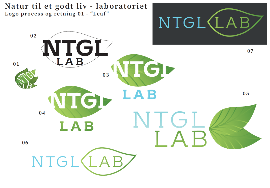
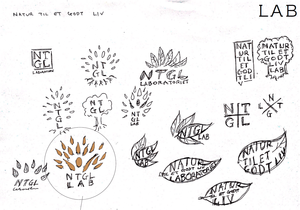
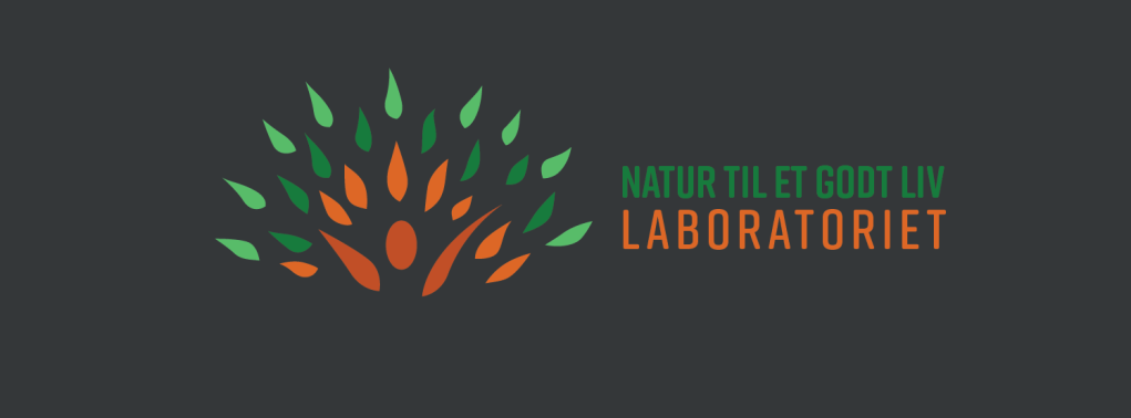
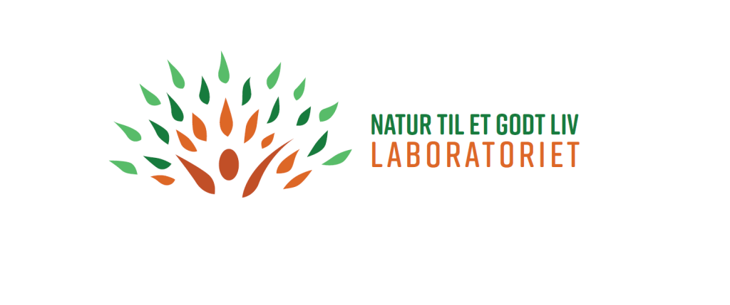


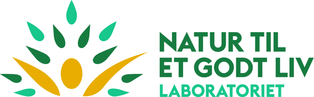
The images above show how the design started as a sketch and became increasingly more finalized in cooperation with the client. Design isn’t permanent however and will always find a way to grow and adapt, sometimes to keep the brand fresh and sometimes to match new values or to cater to the preferences of new management. This is the way of graphic design and the design process. The logo lives on in its new guise with NTGL here: https://www.bikubenfonden.dk/natur-til-et-godt-liv
Other media types
Graphic design can be more than just a digital or print logo however and the journey towards new media types isn’t always easy. Particularly with screen print and embroidery. Below are examples from the JAWGS IP and some of the pro bono work we’ve done for the Royal Danish Air Force.

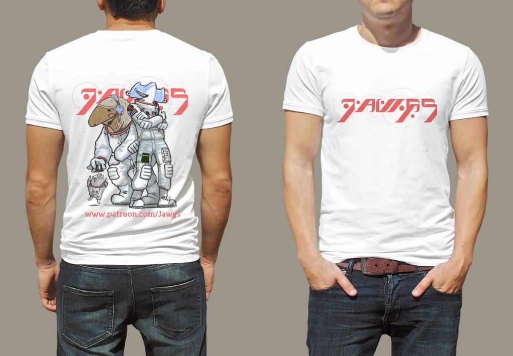


Operation Serval in particular is interesting because the Danish Hercules crews and aircraft were allowed to participate in the French Bastille Day due to their excellent operational performance – and they wore the badge created by us ❤
Illustration and logo
A logo can be made up of several things, commonly it uses a name in a certain typography or a name and an image. In some cases a brand can become so strong that the image no longer needs the accompanying name for the consumer to identify the brand, which can be easily demonstrated by thinking of powerful brands like Nike, Adidas, Shell or Agip. An unknown brand must commonly start with a combination of both or with a clearly legible name however, as we’ll demonstrate below:
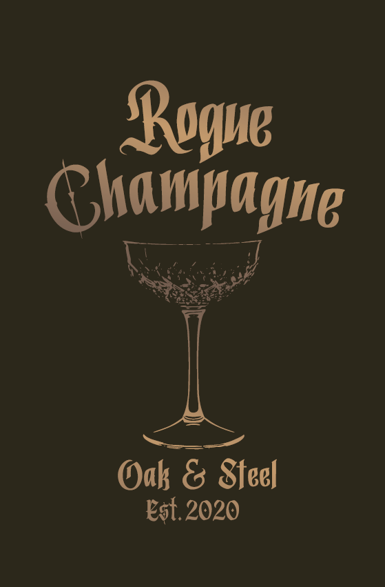
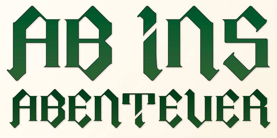
In some cases the typography itself can be part of the exercise in creating a unique look for the client. Typefaces or often communicators of value, style and “brand feel” which is hinted at in our “Abenteuer” typography.
In many cases a logo needs to be a part of a design package, that involves print on packaging or labels. In those cases it is of particular importance to either visualize the packaging in 3D or create paper prototypes so any communication problems are discovered before the design is sent off to a print shop.
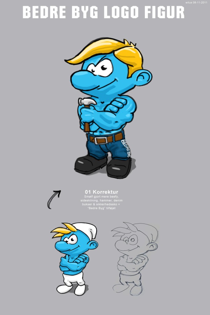
In rare cases, the client might insist on using copyrighted material for their brand, which is ill advised, since both the designer and client can be hit by a copyright strike. We had to discontinue our work with “Bedre Byg” since their demands put them too close to an existing brand. Bedre Byg doesn’t exist anymore.
In some instances a logo is just an informative label that is part of a greater design and often draws upon existing design ideas to communicate. In those cases design can be as simple as a symbol or an icon.
In other – rare – cases a design can become so convoluted that it approaches art and then the brand is suddenly more of a handcrafted style than a symbol.

Graphic design is an exciting field and has roots all the way back to cave paintings. Working with it and identifying symbols and typefaces that matches the preferences of a client is an exciting challenge to us.
“What’s the most challenging logo task you’ve ever handled” you ask? well, a while back, working for Phase One, we’d created this super photorealistic app icon, mainly using photoshop. Which may sound strange today, but as trends go, web 2.0 as the style was called I think, was very popular at the time. The problem arose when the Phase One wanted a vector version.. Illustrator can do very detailed artwork, but converting something with a lot of lighting effects and shadows is a little tricky, it took about a week to build it and you can see the result below 🙂
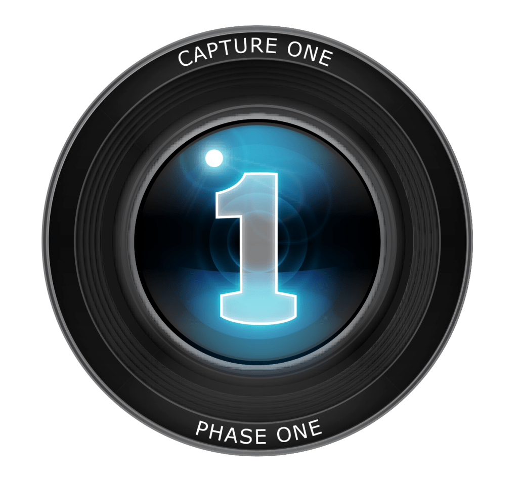
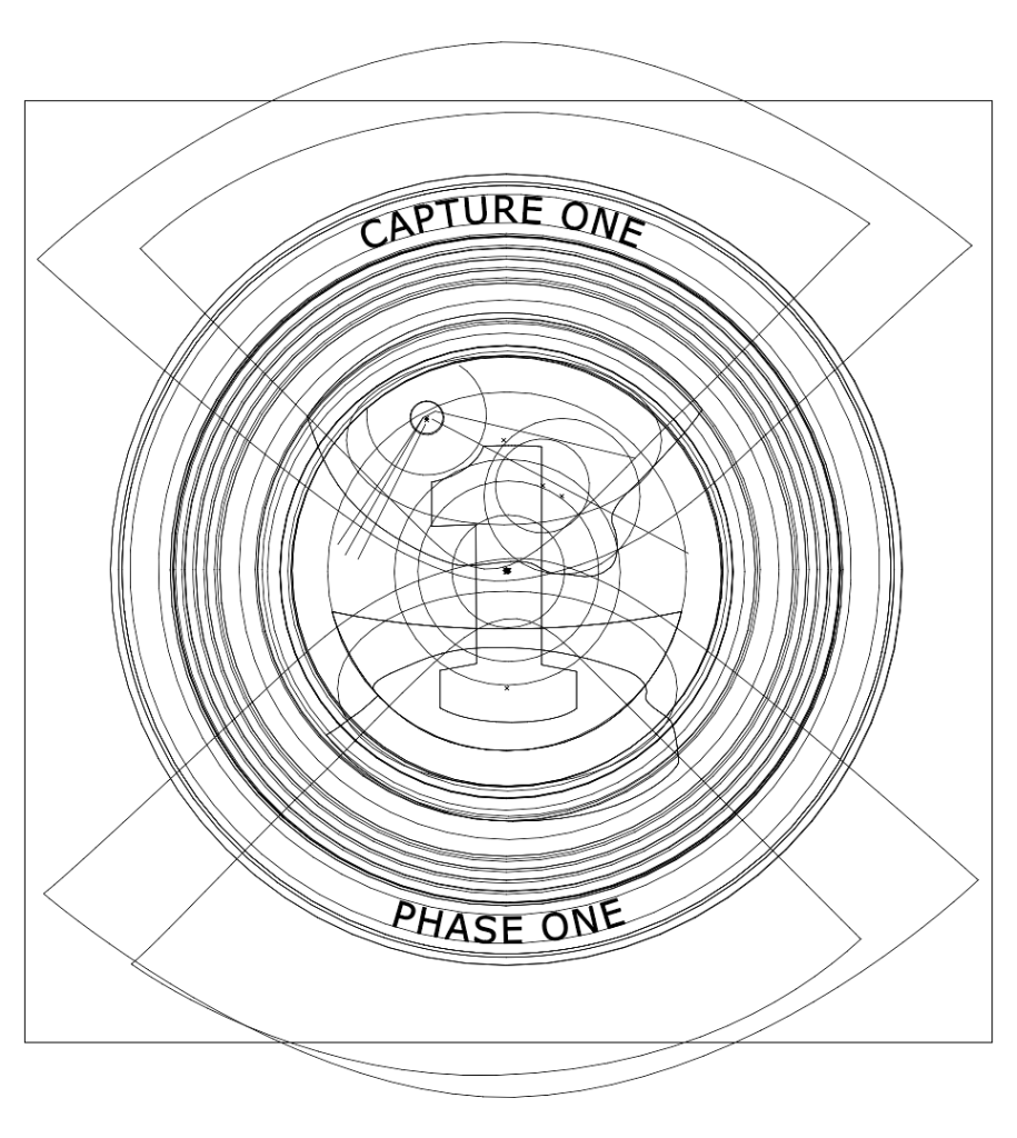
Having the App icon in vector allowed Phase One to scale it to any size they wanted and in this case they wanted to use it on Roll Ups. How did the vectorized result look when it’s not in outline mode? I cheated, the first image IS the vector version ( there’s a slight bit of pixel degradation around the lens, this is illustrators shadow rendering acting up in preview ).
If you want us to have a look at your logo needs, don’t hesitate to give us a holler, you can find telephone and email info in the Contact section 🙂
