
As a designer you will sometimes find yourself drawing upon something that is well hidden in your mental association library and that’s exactly what happened to me when I created the graphical identity for “Korsgade Vin”, a local wine shop. I grew up surrounded by classical artwork reproductions in the house of my parents and that of my aunt – among these were quite a few works by Henri Matisse. And somehow his simple line work found its way into my design process when I worked on the initial logo, which was then called: “Det Vin”.
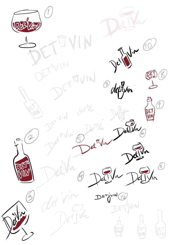
There’s a certain song and rhythm which the client and I both liked in the hand drawn letters and wine glass. It felt like red wine with jazz. Sadly we had to park the identity for a couple of years since the client was a part of a larger wine house. Fortunately he recently decided to go solo, another decision was to anchor the identity in the charming medieval street that the wine shop resides in and hence the identity transformed into: “Korsgade Vin”.

It was possible to keep “Vin” and the glass, but the “Korsgade” lettering required another pass. For a brief moment there was also talk of reverting to a traditional typeface with an accompanying glass.
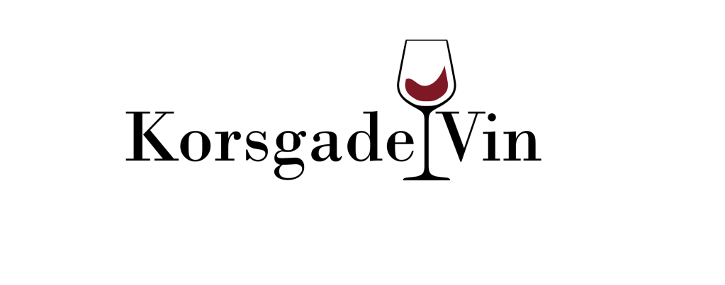
But even though the wine was still in motion, the logo itself seemed to lose its “music” which was a quality the client didn’t want to let go of. That means the logo retained the playful lettering and eventually ended up as seen below.

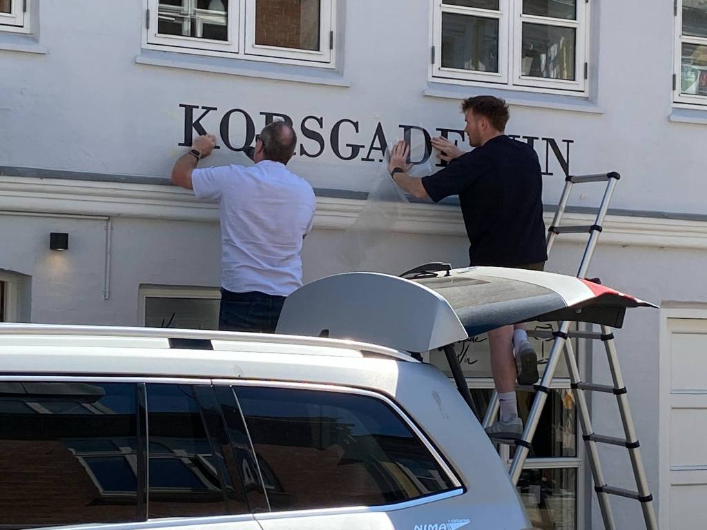
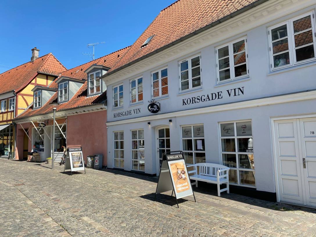
The hand drawn logo was unsuited for the long space above the windows on the shops facade though, so as an addition to the identity, it was decided to allow for a regular font here and from a short process Bodoni was chosen as a fitting typography.
I’m excited to see how the new identity fares and will surely join in one or more of the wine shops many – delicious – events! From wine tasting to drop in events. The shop can be found in Korsgade in Svendborg on Fyn in Denmark.
I’m certain the owner would enjoy your visit as well: https://www.facebook.com/KorsgadeVin

